 css入门
css入门
# 1、backgrounds
| Property | 描述 |
|---|---|
| background (opens new window) | 简写属性,作用是将背景属性设置在一个声明中。 |
| background-attachment (opens new window) | 背景图像是否固定或者随着页面的其余部分滚动。 |
| background-color (opens new window) | 设置元素的背景颜色。 |
| background-image (opens new window) | 把图像设置为背景。 |
| background-position (opens new window) | 设置背景图像的起始位置。 |
| background-repeat (opens new window) | 设置背景图像是否及如何重复。 |
# 1.1、CSS 属性定义背景效果:
background-color
body {background-color:#b0c4de;}1
background-image
body {
    backgroundimage:url('paper.gif');
    background-repeat:repeat-x; /**沿x轴平铺**/
    background-repeat:no-repeat;/**不平铺**/
    background-position:right top;/**调整背景图的位置**/

    /**
    	flex:背景图像固定
    	scroll:背景图像随着内容滚动
    	local:背景图像在元素内部滚动
    **/
    background-attachment:flex;
}
1
2
3
4
5
6
7
8
9
10
11
12
13
14默认:平铺重复显示
background-repeat
background-attachment
background-position
background合着
body {background:#ffffff url('img_tree.png') no-repeat right top;}
# 2、文本(Text)
如果你要调整文本,可以查看下面表格内容
| color (opens new window) | 设置文本颜色 |
|---|---|
| direction (opens new window) | 设置文本方向。 |
| letter-spacing (opens new window) | 设置字符间距 |
| line-height (opens new window) | 设置行高 |
| text-align (opens new window) | 对齐元素中的文本 |
| text-decoration (opens new window) | 向文本添加修饰 |
| text-indent (opens new window) | 缩进元素中文本的首行 |
| text-shadow (opens new window) | 设置文本阴影 |
| text-transform (opens new window) | 控制元素中的字母 |
| unicode-bidi (opens new window) | 设置或返回文本是否被重写 |
| vertical-align (opens new window) | 设置元素的垂直对齐 |
| white-space (opens new window) | 设置元素中空白的处理方式 |
| word-spacing (opens new window) | 设置字间距 |
# 2.1、letter-spacing:
h1 {letter-spacing:2px}
h2 {letter-spacing:-3px}
2
| normal | 默认。规定字符间没有额外的空间。 |
|---|---|
| length | 定义字符间的固定空间(允许使用负值)。 |
| inherit | 规定应该从父元素继承 letter-spacing 属性的值。 |
# 2.2、line-height:
p.small {line-height:90%}
p.big {line-height:200%}
2
| 值 | 描述 |
|---|---|
| normal | 默认。设置合理的行间距。 |
| number | 设置数字,此数字会与当前的字体尺寸相乘来设置行间距。 |
| length | 设置固定的行间距。 |
| % | 基于当前字体尺寸的百分比行间距。 |
| inherit | 规定应该从父元素继承 line-height 属性的值。 |
# 2.3、text-align:
h1 {text-align:center}
h2 {text-align:left}
h3 {text-align:right}
2
3
| 值 | 描述 |
|---|---|
| left | 把文本排列到左边。默认值:由浏览器决定。 |
| right | 把文本排列到右边。 |
| center | 把文本排列到中间。 |
| justify | 实现两端对齐文本效果。 |
| inherit | 规定应该从父元素继承 text-align 属性的值。 |
# 2.4、text-decoration:
h1 {text-decoration:overline}
h2 {text-decoration:line-through}
h3 {text-decoration:underline}
2
3
| 值 | 描述 |
|---|---|
| none | 默认。定义标准的文本。 |
| underline | 定义文本下的一条线。 |
| overline | 定义文本上的一条线。 |
| line-through | 定义穿过文本下的一条线。 |
| blink | 定义闪烁的文本。 |
| inherit | 规定应该从父元素继承 text-decoration 属性的值。 |
# 2.5、text-transform
| none | 默认。定义带有小写字母和大写字母的标准的文本。 |
|---|---|
| capitalize | 文本中的每个单词以大写字母开头。 |
| uppercase | 定义仅有大写字母。 |
| lowercase | 定义无大写字母,仅有小写字母。 |
| inherit | 规定应该从父元素继承 text-transform 属性的值。 |
# 3、字体
font-family 属性应该设置几个字体名称作为一种"后备"机制,如果浏览器不支持第一种字体,他将尝试下一种字体。
注意: 如果字体系列的名称超过一个字,它必须用引号,如Font Family:"宋体"。
p{font-family:"Times New Roman", Times, serif;}
| font (opens new window) | 在一个声明中设置所有的字体属性 |
|---|---|
| font-family (opens new window) | 指定文本的字体系列 |
| font-size (opens new window) | 指定文本的字体大小 |
| font-style (opens new window) | 指定文本的字体样式 |
| font-variant (opens new window) | 以小型大写字体或者正常字体显示文本。 |
| font-weight (opens new window) | 指定字体的粗细。 |
# 3.1、em单位的好处
- 子元素设置为em单位,可以跟随父元素的字体大小变动而变动
- 如果你不指定一个字体的大小,默认大小和普通文本段落一样,是16像素(16px=1em)
# 4、链接:
a:link {color:#000000;}      /* 未访问链接*/
a:visited {color:#00FF00;}  /* 已访问链接 */
a:hover {color:#FF00FF;}  /* 鼠标移动到链接上 */
a:active {color:#0000FF;}  /* 鼠标点击时 */
2
3
4
# 5、列表
| list-style (opens new window) | 简写属性。用于把所有用于列表的属性设置于一个声明中 |
|---|---|
| list-style-image (opens new window) | 将图像设置为列表项标志。 |
| list-style-position (opens new window) | 设置列表中列表项标志的位置。 |
| list-style-type (opens new window) | 设置列表项标志的类型。 |
# 5.1、list-style-type
ul.a {list-style-type: circle;}
ul.b {list-style-type: square;}

ol.c {list-style-type: upper-roman;}
ol.d {list-style-type: lower-alpha;}
2
3
4
5
# 5.2、list-style-image
ul
{
    list-style-image: url('sqpurple.gif');
}
2
3
4
# 6、表格样式
**border-collapse:collapse;**这个是去除间隔的
table
{
    border-collapse:collapse;
}
table,th, td
{
    border: 1px solid black;
}
2
3
4
5
6
7
8
# 7、盒子模型
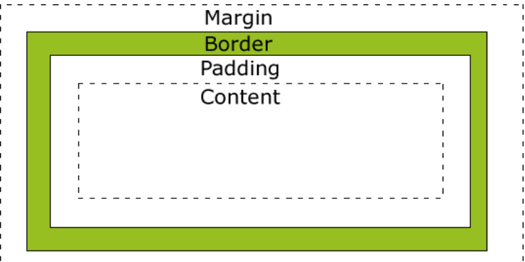
# 8、border(边框)
| 边框样式 | 定义 |
|---|---|
dotted | 定义一个点线边框 |
dashed | 定义一个虚线边框 |
solid | 定义实线边框 |
double | 定义两个边框。两个边框的宽度与 border-width 的值相同 |
groove | 定义 3D 沟槽边框。效果取决于边框的颜色值 |
ridge | 定义 3D 脊边框。效果取决于边框的颜色值 |
inset | 定义一个 3D 的嵌入边框。效果取决于边框的颜色值 |
outset | 定义一个 3D 突出边框。效果取决于边框的颜色值 |
div{
	border:1px red solid;
    border-style:solid;
    border-color:red;
    border-width:10px;

    border-left-style:double;
    border-right=color:red;

    border-top-left-radius:20px;
}
2
3
4
5
6
7
8
9
10
11
# 9、轮廓
轮廓就是border外面的一层
outline:green dotted thick;
# 10、尺寸
| height (opens new window) | 设置元素的高度。 |
|---|---|
| line-height (opens new window) | 设置行高。 |
| max-height (opens new window) | 设置元素的最大高度。 |
| max-width (opens new window) | 设置元素的最大宽度。 |
| min-height (opens new window) | 设置元素的最小高度。 |
| min-width (opens new window) | 设置元素的最小宽度。 |
| width (opens new window) | 设置元素的宽度。 |
# 11、display
隐藏一个元素可以通过把display属性设置为"none",或把visibility属性设置为"hidden"。但是请注意,这两种方法会产生不同的结果。
visibility:hidden可以隐藏某个元素,但隐藏的元素仍需占用与未隐藏之前一样的空间。也就是说,该元素虽然被隐藏了,但仍然会影响布局。
display:none是直接将这个元素从空间布局中抹除掉
**display:inline:**把元素变成行内块元素
**display:block:**把元素变成块级元素
# 12、position
static
- position的默认属性,也就是遵循自然的文档流
- 静态定位的元素不会受到 top, bottom, left, right影响。
relative
- 相对定位元素的定位是相对其正常位置。不是相对其父元素啥的
- 移动相对定位元素,但它原本所占的空间不会改变。
fixed
元素的位置相对于浏览器窗口是固定位置。即使窗口是滚动的它也不会移动:
p.pos_fixed {
    position:fixed;
    top:30px;
    right:5px;
}
1
2
3
4
5
absolute
绝对定位的元素的位置相对于最近的已定位父元素,如果元素没有已定位的父元素,那么它的位置相对于
:采用采用absolute,会照成其脱离原来的文本流,也就是在原来的文本流里面,像消失一样
/**
	只进行这样设置,它现在是就在它原来的位置上
**/
.two{
	position:absolute;
}
/**
	我在进行实验的时候发现一个很怪异的问题,经过探究发现,在.two进行绝对定位的时候,没有父元素进行参考的时候,应该是相对于body进行定位的。但是其位置却并没有发生变动,照成这个的原因是:在.two盒子变成绝对定位的时候,是保持原来的位置不变的,但是当我们调整top或者left的时候就会发现,它是依据body进行调整位置的。
	所以以后在进行绝对定位的时候,为了出现奇异,最好是做了绝对定位后,给top和left赋值为0。
**/
.two{
    position:absolute;
    top:100px;
    left:100px;
}
1
2
3
4
5
6
7
8
9
10
11
12
13
14
15
sticky
这个就是我一直在找的华为导航栏的效果
div.sticky {
  /* position: -webkit-sticky; */
  position: sticky;
  top: 0px;
  padding: 5px;
  background-color: #cae8ca;
  border: 2px solid #4CAF50;
}
1
2
3
4
5
6
7
8当div的top为0的时候,采用position:fixed定位
# 13、OverFlow
| visible | 默认值。内容不会被修剪,会呈现在元素框之外。 |
|---|---|
| hidden | 内容会被修剪,并且其余内容是不可见的。 |
| scroll | 内容会被修剪,但是浏览器会显示滚动条以便查看其余的内容。 |
| auto | 如果内容被修剪,则浏览器会显示滚动条以便查看其余的内容。 |
| inherit | 规定应该从父元素继承 overflow 属性的值。 |
# 14、浮动float
| clear (opens new window) | 指定不允许元素周围有浮动元素。 | left right both none inherit | |
|---|---|---|---|
| float (opens new window) | 指定一个盒子(元素)是否可以浮动。 | left right none inherit |
元素怎样浮动
元素的水平方向浮动,意味着元素只能左右移动而不能上下移动。
一个浮动元素会尽量向左或向右移动,直到它的外边缘碰到包含框或另一个浮动框的边框为止。
浮动元素之后的元素将围绕它。
浮动元素之前的元素将不会受到影响。
如果图像是右浮动,下面的文本流将环绕在它左边:
# 15、对齐方式
# 15.1、采用margin
这个针对块级元素,在整个屏幕中居中
.center {
    margin: auto;
    width: 50%;
    border: 3px solid green;
    padding: 10px;
}
2
3
4
5
6
注意: 如果没有设置 width 属性(或者设置 100%),居中对齐将不起作用。
# 15.2、采用text-align
盒子内的文本居中
.center {
    text-align: center;
    border: 3px solid green;
}
2
3
4
# 15.3、采用position
.right {
    position: absolute;
    right: 0px;
    width: 300px;
    border: 3px solid #73AD21;
    padding: 10px;
}
2
3
4
5
6
7
# 15.4、采用float
.right {
    float: right;
    width: 300px;
    border: 3px solid #73AD21;
    padding: 10px;
}
2
3
4
5
6
# 15.5、采用line-height
.center {
    line-height: 200px;
    height: 200px;
    border: 3px solid green;
    text-align: center;
}

/* 如果文本有多行,添加以下代码: */
.center p {
    line-height: 1.5;
    display: inline-block;
    vertical-align: middle;
}
2
3
4
5
6
7
8
9
10
11
12
13
# 15.6、采用transform
.center {
    height: 200px;
    position: relative;
    border: 3px solid green;
}

.center p {
    margin: 0;
    position: absolute;
    top: 50%;
    left: 50%;
    transform: translate(-50%, -50%);
}
2
3
4
5
6
7
8
9
10
11
12
13
# 16、组合选择符
# 16.1、子元素选择器(>)
与后代选择器相比,子元素选择器(Child selectors)只能选择作为某元素直接/一级子元素的元素。
以下实例选择了
:
**注意:**采用“>”只能针对父元素下面的第一个子元素使用
div>p
{
  background-color:yellow;
}
2
3
4
# 16.2、相邻兄弟选择器(+)
相邻兄弟选择器(Adjacent sibling selector)可选择紧接在另一元素后的元素,且二者有相同父元素。
如果需要选择紧接在另一个元素后的元素,而且二者有相同的父元素,可以使用相邻兄弟选择器(Adjacent sibling selector)。
以下实例选取了所有位于
元素:
div+p
{
  background-color:yellow;
}
2
3
4
# 16.3、后续兄弟选择器(~)
后续兄弟选择器选取所有指定元素之后的相邻兄弟元素。
以下实例选取了所有
:
div~p
{
  background-color:yellow;
}
2
3
4
# 总结:
div>p{}	选中div内的所有子元素
div>p:first-child b:first-child{}选中div内的第一个p标签里面的第一个b标签

div+p{}	选中div同级的第一个p标签
div+p>b:first-child{}选中div同级的第一个p标签里面的第一个b标签

div~p>b:first-child{}选中div同级的所有p标签里面的第一个b标签
2
3
4
5
6
7
# 17、伪类
# 17.1、anchor伪类
注意:在CSS定义中,a:hover 必须被置于 a:link 和 a:visited 之后,才是有效的。
注意:在 CSS 定义中,a:active 必须被置于 a:hover 之后,才是有效的。
a:link{color:red}
a:visted{color:blue}
a:hover{color:organ}
a:active{color:blue}
2
3
4
# 17.2、first-child伪类
您可以使用 :first-child 伪类来选择父元素的第一个子元素。
在一个html中有多个p标签,我要如何才能只针对第一个标签做样式呢?
p:first-child{
    color:blue;
}

<p></p>
<p></p>
<p></p>
<p></p>
/**
	div的第一个p标签的b标签变成红色
**/
div>p:first-child b{
    color:red;
}
2
3
4
5
6
7
8
9
10
11
12
13
14
15
所有CSS伪类/元素
| 选择器 | 示例 | 示例说明 |
|---|---|---|
| :checked (opens new window) | input:checked | 选择所有选中的表单元素 |
| :disabled (opens new window) | input:disabled | 选择所有禁用的表单元素 |
| :empty (opens new window) | p:empty | 选择所有没有子元素的p元素 |
| :enabled (opens new window) | input:enabled | 选择所有启用的表单元素 |
| :first-of-type (opens new window) | p:first-of-type | 选择的每个 p 元素是其父元素的第一个 p 元素 |
| :in-range (opens new window) | input:in-range | 选择元素指定范围内的值 |
| :invalid (opens new window) | input:invalid | 选择所有无效的元素 |
| :last-child (opens new window) | p:last-child | 选择所有p元素的最后一个子元素 |
| :last-of-type (opens new window) | p:last-of-type | 选择每个p元素是其母元素的最后一个p元素 |
| :not(selector) (opens new window) | :not(p) | 选择所有p以外的元素 |
| :nth-child(n) (opens new window) | p:nth-child(2) | 选择所有 p 元素的父元素的第二个子元素 |
| :nth-last-child(n) (opens new window) | p:nth-last-child(2) | 选择所有p元素倒数的第二个子元素 |
| :nth-last-of-type(n) (opens new window) | p:nth-last-of-type(2) | 选择所有p元素倒数的第二个为p的子元素 |
| :nth-of-type(n) (opens new window) | p:nth-of-type(2) | 选择所有p元素第二个为p的子元素 |
| :only-of-type (opens new window) | p:only-of-type | 选择所有仅有一个子元素为p的元素 |
| :only-child (opens new window) | p:only-child | 选择所有仅有一个子元素的p元素 |
| :optional (opens new window) | input:optional | 选择没有"required"的元素属性 |
| :out-of-range (opens new window) | input:out-of-range | 选择指定范围以外的值的元素属性 |
| :read-only (opens new window) | input:read-only | 选择只读属性的元素属性 |
| :read-write (opens new window) | input:read-write | 选择没有只读属性的元素属性 |
| :required (opens new window) | input:required | 选择有"required"属性指定的元素属性 |
| :root (opens new window) | root | 选择文档的根元素 |
| :target (opens new window) | #news:target | 选择当前活动#news元素(点击URL包含锚的名字) |
| :valid (opens new window) | input:valid | 选择所有有效值的属性 |
| :link (opens new window) | a:link | 选择所有未访问链接 |
| :visited (opens new window) | a:visited | 选择所有访问过的链接 |
| :active (opens new window) | a:active | 选择正在活动链接 |
| :hover (opens new window) | a:hover | 把鼠标放在链接上的状态 |
| :focus (opens new window) | input:focus | 选择元素输入后具有焦点 |
| :first-letter (opens new window) | p:first-letter | 选择每个 元素的第一个字母 |
| :first-line (opens new window) | p:first-line | 选择每个 元素的第一行 |
| :first-child (opens new window) | p:first-child | 选择器匹配属于任意元素的第一个子元素的 元素 |
| :before (opens new window) | p:before | 在每个 元素之前插入内容 |
| :after (opens new window) | p:after | 在每个 元素之后插入内容 |
| :lang(language) (opens new window) | p:lang(it) | 为 元素的lang属性选择一个开始值 |
# 18、css伪元素
# 18.1、:first-line 伪元素
选中p标签的第一行文本内容

p:first-line
{
    color:#ff0000;
    font-variant:small-caps;
}
2
3
4
5
6
7
注意:"first-line" 伪元素只能用于块级元素。
注意: 下面的属性可应用于 "first-line" 伪元素:
- font properties
- color properties
- background properties
- word-spacing
- letter-spacing
- text-decoration
- vertical-align
- text-transform
- line-height
- clear
# 18.2、:first-letter 伪元素
选中p标签第一行的第一个单词
p:first:letter{
	color:red
}
2
3
4
注意: "first-letter" 伪元素只能用于块级元素。
注意: 下面的属性可应用于 "first-letter" 伪元素:
- font properties
- color properties
- background properties
- margin properties
- padding properties
- border properties
- text-decoration
- vertical-align (only if "float" is "none")
- text-transform
- line-height
- float
- clear
# 18.3、CSS - :before 伪元素
在h1标签的头部加上一张图片,但是不能改变其大小
h1:before{
    content:url('../assets/images.png')
}
2
3
4
# 18.4、:affter伪元素
h1:after{
    content:url("./assets/img.png")
}
2
3
所有CSS伪类/元素
| 选择器 | 示例 | 示例说明 |
|---|---|---|
| :link (opens new window) | a:link | 选择所有未访问链接 |
| :visited (opens new window) | a:visited | 选择所有访问过的链接 |
| :active (opens new window) | a:active | 选择正在活动链接 |
| :hover (opens new window) | a:hover | 把鼠标放在链接上的状态 |
| :focus (opens new window) | input:focus | 选择元素输入后具有焦点 |
| :first-letter (opens new window) | p:first-letter | 选择每个 元素的第一个字母 |
| :first-line (opens new window) | p:first-line | 选择每个 元素的第一行 |
| :first-child (opens new window) | p:first-child | 选择器匹配属于任意元素的第一个子元素的 元素 |
| :before (opens new window) | p:before | 在每个 元素之前插入内容 |
| :after (opens new window) | p:after | 在每个 元素之后插入内容 |
| :lang(language) (opens new window) | p:lang(it) | 为 元素的lang属性选择一个开始值 |
# 19、导航栏
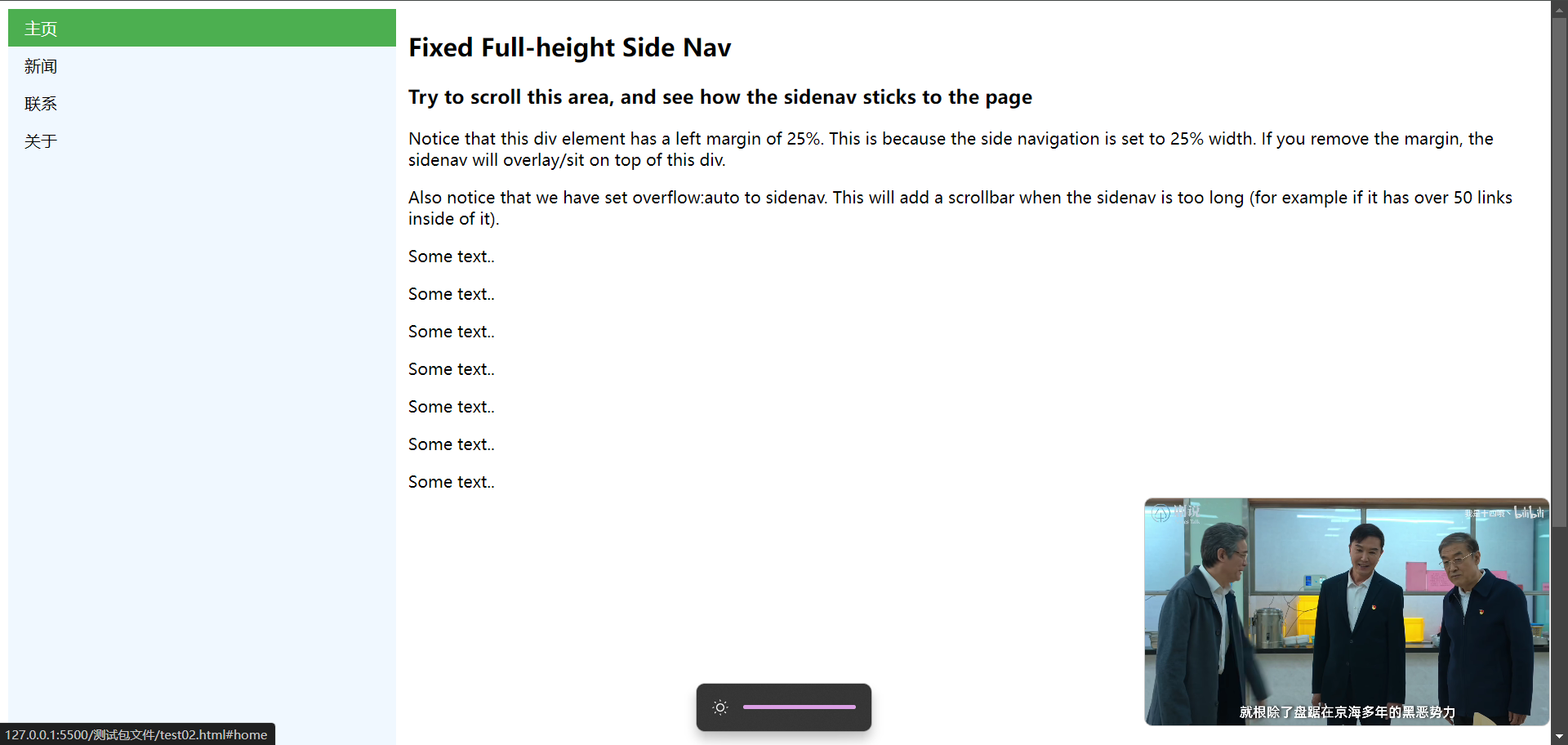
# 19.1、侧边导航栏
<!DOCTYPE html>
<html lang="en">
<head>
<meta charset="UTF-8">
<meta name="viewport" content="width=device-width, initial-scale=1.0">
<title>Document</title>
<style>
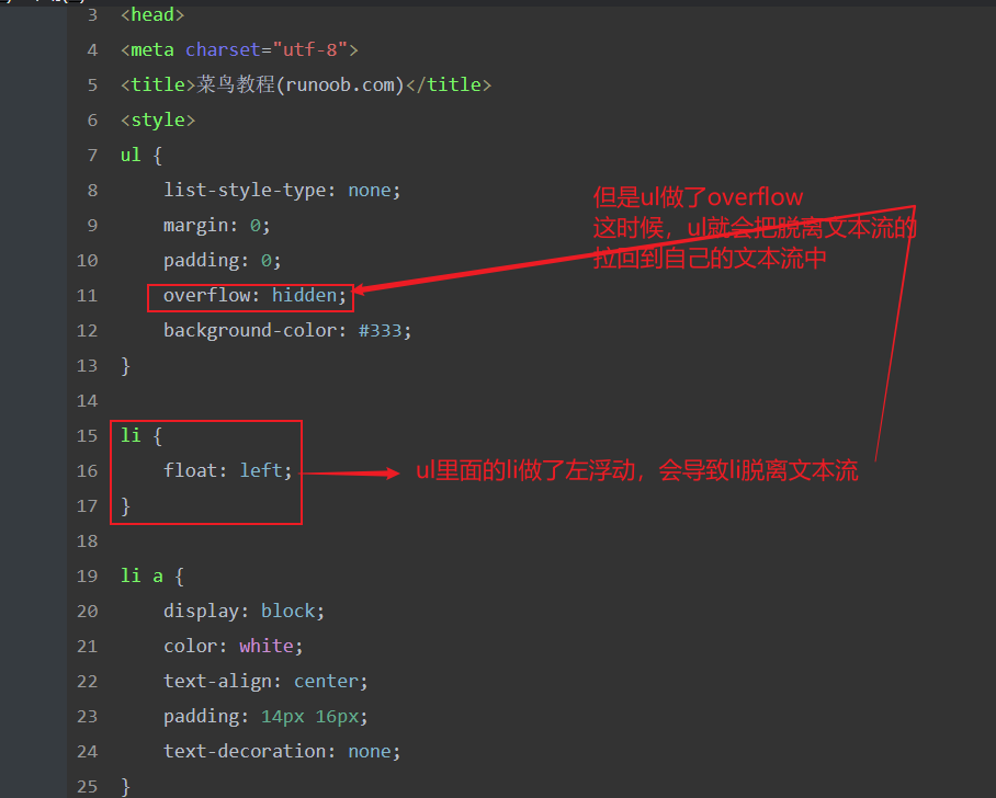
ul{
list-style-type: none;
background-color: aliceblue;
width: 25%;
position: fixed;
height: 100%;
margin: 0;
padding: 0;
overflow: auto;
}
li a{
display: block;
text-decoration: none;
padding: 8px 16px;
color: black;
}
li a.active{
background-color: #4CAF50;
color: white;
}
li a:hover:not(.active){
background-color: #555;
color: white;
}
</style>
</head>
<body>
<ul>
<li><a class="active" href="#home">主页</a></li>
<li><a href="#news">新闻</a></li>
<li><a href="#contact">联系</a></li>
<li><a href="#about">关于</a></li>
</ul>
<div style="margin-left:25%;padding:1px 16px;height:1000px;">
<h2>Fixed Full-height Side Nav</h2>
<h3>Try to scroll this area, and see how the sidenav sticks to the page</h3>
<p>Notice that this div element has a left margin of 25%. This is because the side navigation is set to 25% width. If you remove the margin, the sidenav will overlay/sit on top of this div.</p>
<p>Also notice that we have set overflow:auto to sidenav. This will add a scrollbar when the sidenav is too long (for example if it has over 50 links inside of it).</p>
<p>Some text..</p>
<p>Some text..</p>
<p>Some text..</p>
<p>Some text..</p>
<p>Some text..</p>
<p>Some text..</p>
<p>Some text..</p>
</div>
</body>
</html>
2
3
4
5
6
7
8
9
10
11
12
13
14
15
16
17
18
19
20
21
22
23
24
25
26
27
28
29
30
31
32
33
34
35
36
37
38
39
40
41
42
43
44
45
46
47
48
49
50
51
52
53
54
55
56
57
58
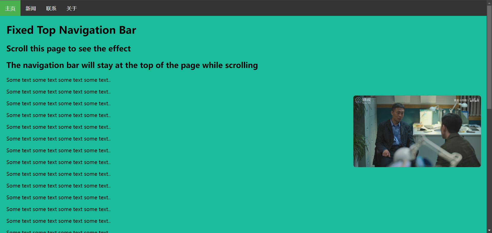
# 19.2、头部导航栏
<!DOCTYPE html>
<html>
<head>
<meta charset="utf-8">
<title>菜鸟教程(runoob.com)</title>
<style>
body {margin:0;}

ul {
    list-style-type: none;
    margin: 0;
    padding: 0;
    overflow: hidden;
    background-color: #333;
    position: fixed;
    top: 0;
    width: 100%;
}

li {
    float: left;
}

li a {
    display: block;
    color: white;
    text-align: center;
    padding: 14px 16px;
    text-decoration: none;
}

li a:hover:not(.active) {
    background-color: #111;
}

.active {
    background-color: #4CAF50;
}
</style>
</head>
<body>

<ul>
  <li><a class="active" href="#home">主页</a></li>
  <li><a href="#news">新闻</a></li>
  <li><a href="#contact">联系</a></li>
  <li><a href="#about">关于</a></li>
</ul>

<div style="padding:20px;margin-top:30px;background-color:#1abc9c;height:1500px;">
<h1>Fixed Top Navigation Bar</h1>
<h2>Scroll this page to see the effect</h2>
<h2>The navigation bar will stay at the top of the page while scrolling</h2>

<p>Some text some text some text some text..</p>
<p>Some text some text some text some text..</p>
<p>Some text some text some text some text..</p>
<p>Some text some text some text some text..</p>
<p>Some text some text some text some text..</p>
<p>Some text some text some text some text..</p>
<p>Some text some text some text some text..</p>
<p>Some text some text some text some text..</p>
<p>Some text some text some text some text..</p>
<p>Some text some text some text some text..</p>
<p>Some text some text some text some text..</p>
<p>Some text some text some text some text..</p>
<p>Some text some text some text some text..</p>
<p>Some text some text some text some text..</p>
<p>Some text some text some text some text..</p>
<p>Some text some text some text some text..</p>
<p>Some text some text some text some text..</p>
<p>Some text some text some text some text..</p>
<p>Some text some text some text some text..</p>
<p>Some text some text some text some text..</p>
</div>

</body>
</html>
2
3
4
5
6
7
8
9
10
11
12
13
14
15
16
17
18
19
20
21
22
23
24
25
26
27
28
29
30
31
32
33
34
35
36
37
38
39
40
41
42
43
44
45
46
47
48
49
50
51
52
53
54
55
56
57
58
59
60
61
62
63
64
65
66
67
68
69
70
71
72
73
74
75
76
77
78
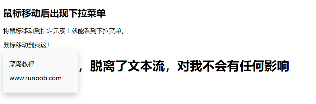
# 20、下拉菜单
<!DOCTYPE html>
<html lang="en">
<head>
    <meta charset="UTF-8">
    <meta name="viewport" content="width=device-width, initial-scale=1.0">
    <title>Document</title>
    <style>

        .dropdown-content {
            display: none;
            background-color: #f9f9f9;
            min-width: 160px;
            box-shadow: 0px 8px 16px 0px rgba(0,0,0,0.2);
            padding: 12px 16px;
            position: absolute;
        }
        .dropdown:hover .dropdown-content {
            display: block;

        }
    </style>
</head>
<body>
    <h2>鼠标移动后出现下拉菜单</h2>
<p>将鼠标移动到指定元素上就能看到下拉菜单。</p>

<div class="dropdown">
  <span>鼠标移动到我这!</span>
  <div class="dropdown-content">
    <p>菜鸟教程</p>
    <p>www.runoob.com</p>
  </div>
  <h1>弹窗内容已经,脱离了文本流,对我不会有任何影响</h1>
</div>
</body>
</html>
2
3
4
5
6
7
8
9
10
11
12
13
14
15
16
17
18
19
20
21
22
23
24
25
26
27
28
29
30
31
32
33
34
35
36
<!DOCTYPE html>
<html lang="en">
<head>
    <meta charset="UTF-8">
    <meta name="viewport" content="width=device-width, initial-scale=1.0">
    <title>Document</title>
    <style>
        .dropdown{
            position: relative;
        }
        .dropdown:hover .dropdown-content{
            display: block;
        }
        .dropdown:hover .dropbtn{
            background-color: #0e260f;
        }
        .dropbtn{
          background-color: #4CAF50;
          border: none;
          font-size: 16px;
          color: white;
          cursor: pointer;
          padding: 16px;
        }
        .dropdown-content{
            display: none;
            position: absolute;
            background-color:  #f9f9f9;
            min-width: 160px;
            box-shadow: 0px 8px 16px 0px rgba(0,0,0,0.2);
        }
        .dropdown-content a{
            display: block;
            text-decoration: none;
            padding: 12px 16px;
            color: black;
        }
     .dropdown-content a:hover{
            background-color: #f1f1f1;
        }
    </style>
</head>
<body>
    <div class="dropdown" style="float:left;">
        <button class="dropbtn">左</button>
        <div class="dropdown-content" style="left:0;">
          <a href="#">菜鸟教程 1</a>
          <a href="#">菜鸟教程 2</a>
          <a href="#">菜鸟教程 3</a>
        </div>
      </div>

      <div class="dropdown" style="float:right;">
        <button class="dropbtn">右</button>
        <div class="dropdown-content">
          <a href="#">菜鸟教程 1</a>
          <a href="#">菜鸟教程 2</a>
          <a href="#">菜鸟教程 3</a>
        </div>
      </div>
</body>
</html>
2
3
4
5
6
7
8
9
10
11
12
13
14
15
16
17
18
19
20
21
22
23
24
25
26
27
28
29
30
31
32
33
34
35
36
37
38
39
40
41
42
43
44
45
46
47
48
49
50
51
52
53
54
55
56
57
58
59
60
61
62
# 21、提示弹窗
<!DOCTYPE html>
<html lang="en">
<head>
    <meta charset="UTF-8">
    <meta name="viewport" content="width=device-width, initial-scale=1.0">
    <title>Document</title>
    <style>
        .tooltip{
            position: relative;
            display: inline-block;
            border-bottom: 1px dotted black;
        }
        .tooltip:hover .tooltiptext{
           visibility: visible;
           opacity: 1;
        }
        .tooltiptext{
            visibility: hidden;
            width: 120px;
            background-color: black;
            color: white;
            text-align: center;
            padding: 5px 0;
            position: absolute;
            z-index: 1;
            bottom:100%;
            left: 50%;
            margin-left: -60px;
            opacity: 0;
            transition: opacity 1s;

        }
    </style>
</head>
<body>
    <h2>提示工具淡入效果</h2>
    <p>鼠标移动到以下元素,提示工具会再一秒内从 0% 到 100% 完全显示。</p>
    <div class="tooltip">
        鼠标移动到我这
        <span class="tooltiptext">提示文本</span>
    </div>
</body>
</html>
2
3
4
5
6
7
8
9
10
11
12
13
14
15
16
17
18
19
20
21
22
23
24
25
26
27
28
29
30
31
32
33
34
35
36
37
38
39
40
41
42
43